Category: Painting
Painting Marvel Crisis Protocol – She-Hulk
I’m going the route of fun characters for my Avengers list. The superhero lawyer, Jennifer Walters, aka She-Hulk, was a model I wanted. Sadly, seems the group think around She-Hulk is she’s underpowered for a 6 threat. However I love the character and certainly wanted a high threat roster member for those upper limit crisis missions, so She-Hulk was going to be part of my team.
As most of my MCP stuff, I’ve been leaning heavily into Vallejo Xpress contrast paints and using their acrylics too. With a slapchop base of grey primer, drybrushed white, I worked on sections of the jumper using Gloomy Violet Xpress.

I then gave Jennifer Walters a base of Troll Green Xpress which really provided a wonderful look.

Her jumper was a little tricky. I first gave a pass with Templar White Xpress, and then followed up with a thinned Sky Grey. The creases and folds in her jumper I defined further with did a 1:1 of Sky Grey/Pale Grey Blue. For her hair I used a 1:1 mix of Lizard Green/Black Lotus Xpress

I put some more attention on the girder and went with a base coat of Copper Brown Xpress.

I did a final pass over her jumper with White. I thinned it some and dappled it on with a coarse brush.

For She-Hulk’s skin I worked in highlights using a mix of 1:1 Troll Green Xpress/Uniform Green. I shifted to a final highlight of sections just using Uniform Green acrylic paint.

The final bits were using various paints I have to touch up sections of her base. I used some orange colors to add a rust effect to the girder. I also used a red brick color to some of the base to provide a little contrast. I finally used a thin wash of sepia ink on some base sections and GW Ratling Grime contrast for other parts of the base.

Overall I really liked the look I got for She-Hulk. I forgot the cardinal sin of painting white being you basically use every other color for a base coats, washes, and shading other than actual white. Instead, best to use white as that final drybrush for highlights. But in the end, I think she looks pretty good and ready to smash up baddies for my next MCP game.
Painting Marvel Crisis Protocol – Luke Cage
Like probably every other MCP person out there, I’m working on filling out my Avengers roster. But I wanted to get some folks that could do double duty and work with a Defenders list. I have a soft spot for Daredevil and the street level heroes, so thought Luke Cage, aka Power Man, would be a good choice.
Going with Vallejo Xpress contrasts and paints, I put a base slapchop coat down using a gray primer and white drybrush. For the jeans I put down a coat of Storm Blue Xpress. Quite honestly, I just left it with a single coat. The coverage looked great giving the mini a faded jeans look.

For his shirt, I put down a coat of Imperial Yellow Xpress, then a coat of Deep Yellow paint. I still wanted a deeper tone, so I gave the shirt a final wash of Amarillo ink.


To give the shirt a little depth, I used a 1:1 mix of Transparent Yellow and Deep Yellow. I then put down some final highlights of Deep Yellow.

Luke’s skin got a base coat of Smoke. It’s a really dark brown that I love. For the belt and bracers, I departed some from the classic comic look and went with Beige for a leather look. The skin, bracers, and belt got a final wash of thinned Army Painter Strong Tone.

I painted his boots Black and gave his skin some soft highlights of Beige. With that, the model was done.

I deviated a little with only Vallejo paints, using some GW contrast paints for the girder and cement cracks. Also looking at a lot of the previous pics, you might get the impression the skin is too shiny. And if using inks and certain washes that can also give minis too much of a shine. However I wanted to demonstrate how well a good coat of matte varnish helps. Just a single coat and it completely softens the paint job, ending up with a great look. Sweet Christmas, I can’t wait to get him on the table.

Jumped into the YouTube Pool
Welp, decided to go with the rising tide of streaming and videos. Enjoy blogging and still think I’ll be putting up written reviews for things that strike my gaming fancy. But I can’t deny that the days of the written blog are waning. I still enjoy making gaming content and likely focus more on documenting my bench and tabletop time with videos going forward. My first effort is linked below.
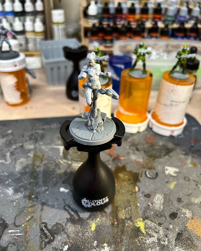
Painting Marvel Crisis Protocol – Ms Marvel
Continuing my painting efforts to finish an Avengers roster, I veered towards doing fun stuff and worked on Ms Marvel. I love the character and for any comic nerds, highly recommend checking the title out. If you want a lighter superhero book that’s just fun, Ms Marvel has got it in spades.
As I’ve mentioned before working with contrasts, I’ve leaned heavily into the Slapchop method. For Vallejo Xpress contrasts I’ve found you can get away with just a white drybrush over gray primer.

I stuck with Vallejo paints all throughout. For her uniform tunic I went with Xpress Mystic Blue and her sleeves, leggings, and scarf Xpress Velvet red. Especially for the Velvet Red, I just love the deep tones you get as shading right from the pot.

I highlighted her uniform with 1:1 with Vallejo’s Xpress Mystic Blue/Ultra Marine, and a 1:1 Xpress Velvet Red/Carmine Red. The uniform piping and lightning bolt I gave a base coat of Desert Yellow and then a coat of Transparent Yellow to brighten it up some.

For her skin, I put down a base of Beige Brown. I used Gold for her bracelet. It’s a little bright but figured once I got a wash down, it would darken niceley.

After the base skin parts were painted I then gave her a sepia ink wash, including her bracelet. As final skin highlights, I used Orange Brown. For her hair I used Smoke and highlighted it with Beige Brown.

The last bits were for the base. Just some copious drybrushing for the concrete barrier and curb. I gave the manhole cover a quick cover of contrast paint and called it done. Gonna be fun to see her on the tabletop.

Painting Marvel Crisis Protocol – Daredevil
Continuing my efforts in completing a pile of unpainted plastic, I took a stab at Daredevil. This time I completely embraced using Xpress contrast paints by pretty much using them for most of the uniform. I love the dark hue of Vallejo Xpress Velvet Red and think it pretty much gave a great look to his costume just using a single coat.
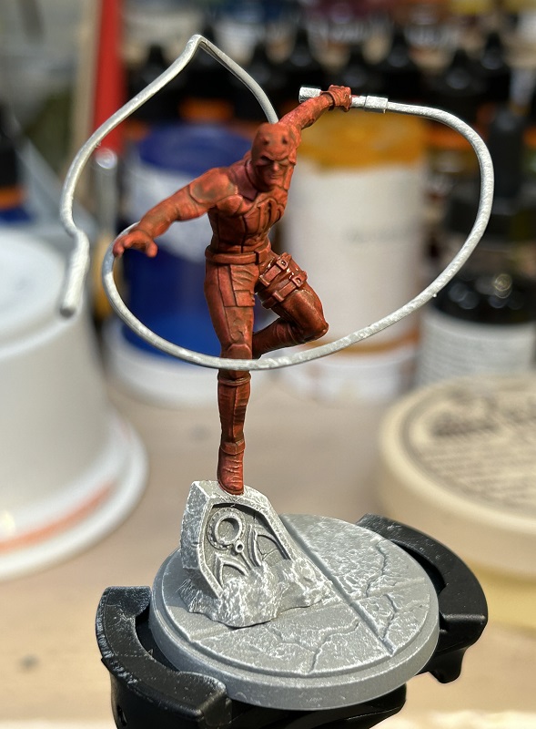
To make Daredevil’s chest symbol and baton webbing stand out more, I put down a coat of Vallejo Red. For his skin, I used a coat of Vallejo Dark Flesh.

The baton cable I put down a coat of Xpress Templar White, and painted some of the underside sections with Vallejo Basalt Grey.
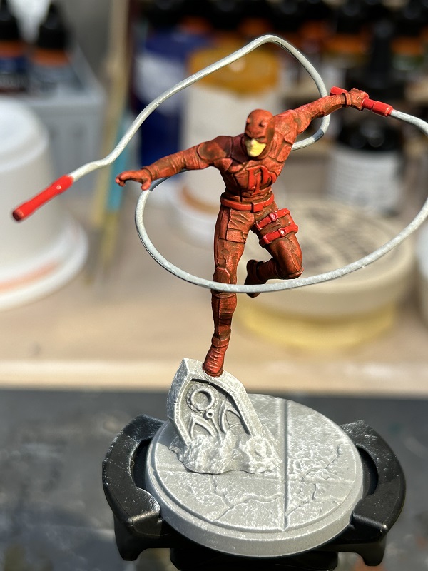
For some final touches, I gave the skin on his face an Army Painter Strong Tone wash. I also mixed a 1:1 of Xpress Velvet Red and Vallejo Red to paint the underside of the baton he was holding, along with some parts of this thigh webbing. As a last touch, I dabbled in using GW contrasts, using Ratling Grime to give the tombstone and sections of the base some detail. I also went over underside sections of the baton cable with that dark contrast, to add just a little more to it.

The final result isn’t going to win any painting awards. It’s a pretty slapdash job. But oddly I think it just works for Daredevil. Despite the name, he never felt a flashy character and the muted, basic look to me fits with him being a street level hero, keeping Hell’s Kitchen safe. Good enough for the tabletop I think.
Painting Marvel Crisis Protocol – Black Widow
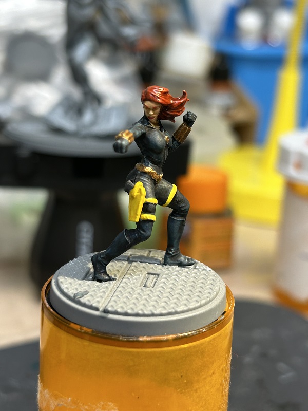
Continuing my painting exploits, I’m just about done with the core set and moving on to some other models. Yet, I’ve still got a few Avengers on the bench and Black Widow was next in the queue. As with much of my other models, I’ve really come to embrace Vallejo Xpress contrasts and started off giving her 2 coats of Black Lotus Xpress for a really dark jumpsuit look as one coat just didn’t seem to get as dark as I wanted (pic is with one coat).

For her webbing, bracers and belt, I put down a base coat of Desert Yellow. As a final touch for her belt and bracers, I mixed metallic Gold with sepia ink and used it as a wash for these sections of the model.
Her skin was a coat of Basic Skin Tone, and for Black Widow’s hair and eyebrows, I used Plasma Red Xpress.
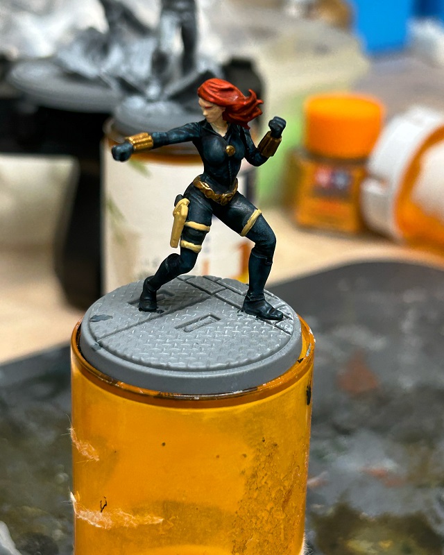
I gave highlights in her hair a single pass of Amaranth Red. Then have both her skin and hair a wash of sepia ink. For the webbing I used a coat of transparent Yellow, and a final highlight of Deep Yellow. I went back and forth considering adding lipstick. Typically I’d add it to the lower lip only, but it was difficult to get it down just right, so I ended up just sticking with a natural skin tone.
I used Dark Blue Grey for the pistol grip and highlights for her jumpsuit. I first used a perspective of looking directly over the model and liberally coating portions of her jumpsuit that I could see. Then I edged it out some for these areas to break up the transition. This forced perspective allowed me to really key in parts of the figure that would naturally be lighter.
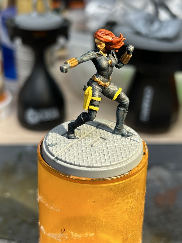
I used a generic red craft paint for the bricks on the base. Then a final coat of GW Ratling Grime contrast to pick out the details of the brick mortar and metal grill. Just a basic wash to give the base a little love and Black Widow was ready for the tabletop.

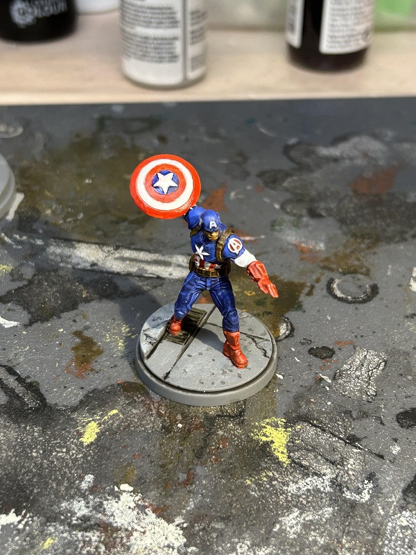
Painting Marvel Crisis Protocol – Captain America
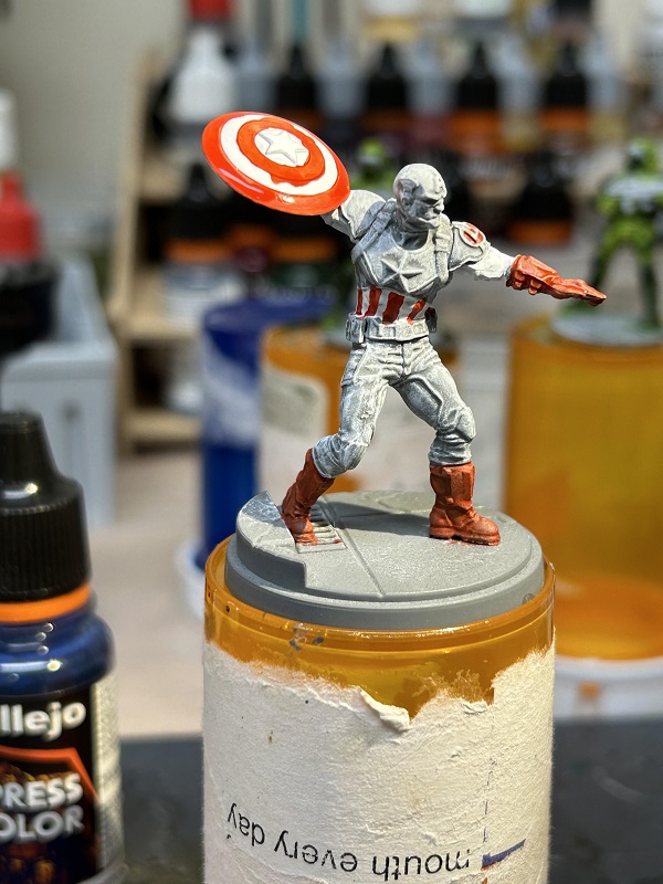
Last time I detailed my paint scheme for Captain Marvel. This time I’m going to go over the other Captain in the Marvel Crisis Protocol core set, Captain America. Like the other models I painted I primarily used Vallejo Xpress contrast paints (with Vallejo acrylics on other portions). A slightly different approach over your typical slop chop method, I painted a base coat of white over parts of the model. Cap’s waist, biceps, and outward section of the shield were all given a coat of white.
For the red used on the mini, I used Xpress Plasma Red. His gloves and boots were over a gray base coat with a liberal drybrush of white. The piping of his waist and the shield simply had stripes of red painted on. With a different undercoat, the red for these sections really stood out more compared to Cap’s hands and feet. I did have to go over sections of the shield a few times to clean up the stripes. I imagine a more careful hand could have done this easily, but it took me a few tries.
For the center part of the shield and the rest of Captain America’s uniform, I used Xpress Storm Blue. Painting it unthinned, I think it really gave a wonderful look to the figure.

For his face I put down a base color of Dark Flesh. The chin strap, belt and webbing got a base coat of German Camo Medium, with the buckles having a base coat of Gunmetal Gray. The underside of the shield I used Neutral Gray for a base coat.
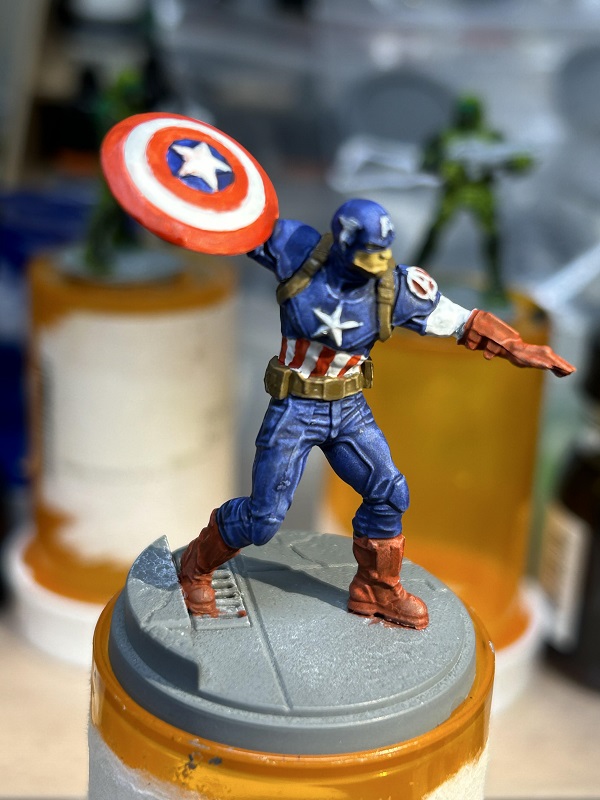
A final wash of Sepia Ink over the belt, underside of the shield, skin, and webbing was added for a little more depth. I also gave his uniform highlights of blue with Ultra Marine. And for his gloves and boots, an initial highlight of Carmine Red and White at 1:1, with a final coat of Plasma Red Xpress.
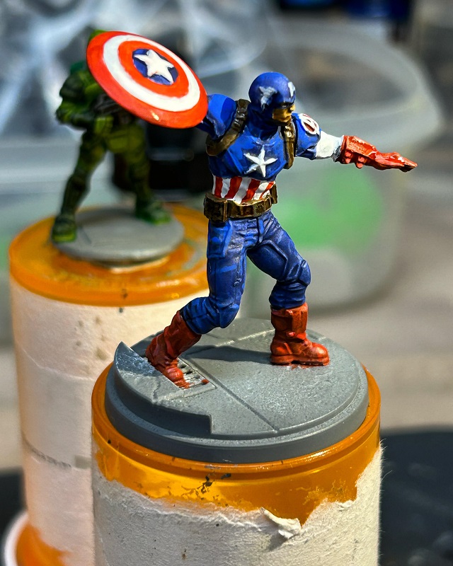
A little attention to the base and a final gloss varnish was applied to the shield to give it a slight reflective shine. Good enough for the tabletop. Might move onto Ms. Marvel next.
Painting Marvel Crisis Protocol – Captain Marvel
Last time I covered my approach to Iron Man, next up on my bench was Captain Marvel. This time I used a more typical approach to contrasts using a modified slop chop method. I found that the Vallejo Xpress contrasts are really vibrant paints. GW contrasts needs that black wash to bring out the shadowed depth of color. With the Vallejo Xpress paints I could just use a simple white drybrush over gray primed minis. For other colors I used Vallejo acrylic paints.
For much of her suit I used Xpress Mystic Blue which gave her a lovely deep blue base. Note on the hands I was going for a fiery color, so I gave her hands and some of her forearms a white base coat.


For her sash, shoulders, and boots, I used Xpress Velvet Red. I also blended in Carmine Red for her shoulders and boots, and gave a simple highlight coat to portions of her sash belt. Her shoulder piping I used a base coat of Orange Ochre and blended in Deep Yellow. I also did this for her hair.

For Captain Marvel’s skin, I used Vallejo Basic Skin Tone for a base coat, followed up with a wash using Army Painter Soft Tone. Dead simple. Her hands I wanted a blazing look by giving a thin coat of Deep Yellow, followed up with a wash of Fluorescent Orange. I finally highlighted her hands and raised parts of her wrists with a Fluorescent Yellow.

I dabbled a little with an OSL effect using Deep Yellow thinned with Vallejo Glaze Medium. This ended up having some muddled results. For raised smooth sections like her thigh and chest, it turned out pretty good, giving a thin coat. But the medium was so thinned, for sections on her ribs, it seeped into the recesses of her uniform, instead of staying on the raised parts like I wanted. In retrospect, I should have done a quick drybrush first, and then touched up areas with the medium glaze to soften any harsh highlights. Regardless, she turned out pretty good. Next on the bench, Captain America.

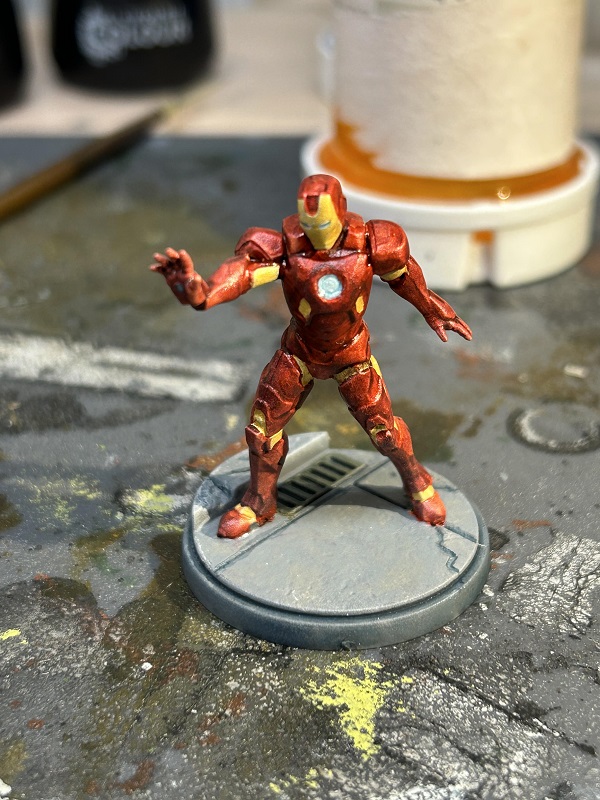
Painting Marvel Crisis Protocol – Iron Man
I’ve had my Marvel Crisis Protocol core set languishing on the shelf for a while. Love the game and likely will get a review up sometime. But I eagerly assembled and primed the minis, but they sat on the back of the paint bench for months. In that interim I’ve been dabbling a little more with contrast paints and finally was able to pick up the Vallejo Xpress line. I really love these contrast paints and they have vibrant colors. For some minis they might not be a good fit, needing a fair amount of thinning to use. But for my MCP stuff they seemed a perfect fit to match that pop of comic book colors.
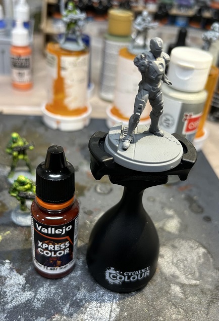
For Iron Man I decided to try a different approach that I typically use for contrasts, and gave the entire model a base coat of Vallejo gold. Usually I use the “slop chop” method. Take a gray primed mini, give it a thinned black wash, and then a strong drybrush of white. For the Vallejo contrasts I don’t even bother using a black wash, and instead just rely on white drybrushed over gray primed figures. However for Iron Man I wanted to try and get a slight metallic tint of red so I went with a gold base coat.

Over sections I wanted red, I used Xpress Velvet Red. I used it undiluted with a single coat. In retrospect, likely thinning it out more and doing multiple coats would have given a better candy apple paint job for the armor, but I was still happy with the results.

For the eyes, hand repulsors and arc reactor, I went with white blended some with Xpress Space Grey. Just enough to give a tinge of blue around the edges. I also touched up a few parts on the boots and legs with Vallejo gun metal for those few bits that had a different paint job.

I used a matte varnish to coat the mini and then later painted on a gloss varnish. This gave the figure a subtle shine. A little bit of detail on the base and I was done. A super simple paint job to get Iron Man ready for the tabletop.
I also found a site that does suit replicas. While it’s not likely a 100% accurate depiction of the Mk III suit, I thought it was good enough. And even better it had a lot of different perspectives to give you a good reference while painting.
Contrast Paints
A while back I mentioned a new type of product on the market, contrast paints. Essentially it’s a paint-medium mix that is more of an intense glaze. The idea is the paint flows easily over a surface, gathering in cracks and having a thinner coat over raised surfaces. What you would usually get with a base coat and wash, you could get with a single coat of contrast paints. Additionally as it’s more transparent that your typical paint, you can get a slight highlight effect too.
Aside from Games Workshop, Vallejo and Army Painter have also thrown their hats into the contrast paint ring. I’ve only dabbled in using paints from GW and Vallejo so far (and I’ve fallen in love with the Vallejo Xpress paints). I steered clear of Army Painter due to issues of the paint reactivating when it becomes wet. There are workarounds with the Army Painter Speedpaints to minimize this, but the property of these contrast paints was pretty much a deal breaker for me ever buying them.
The concept of contrast paints is to use a neutral primer as an undercoat. And then pretty much lay down coats of contrast. As the paints are a little transparent, you really can’t paint over existing coats with different colors unless you are looking to mix hues to get a different shade. Instead you need to apply an undercoat and repaint. So if making some mistakes, it’s best to have brush-on primer handy in a shade similar to the undercoat being used, touch up any whoopsies, and keep painting with contrasts.
Working with contrast paints has been a learning experience though. Generally you can get away with using it directly from the pot. But depending on the pigmentation intensity you are going for, you may need to carefully thin it some with water and/or contrast medium. I found it better to work with lighter shades first, and then use darker shades so that you might be able to bypass touch ups with primer entirely.
The GW contrast line dries quickly and works best steadily painting to cover an entire section of a surface while it’s wet, before moving onto other parts of a model. If say, painting only half a space marine shoulder pad, you might get some uneven results coming back to the other half once that section dries. The portion you painted previously might get some brush strokes and repainting over those parts can impart a darker hue, potentially making that desired color you are striving for a little uneven.
I also learned that a single undercoat just wasn’t enough to bring out the depth possible with contrast paints. I tried first drybrushing white over gray primer. This helped in bringing out the highlights of a model allowing the contrast paint to work better as a glaze.

However I still wasn’t quite happy with the depth of color for the models as you can see with these battle mechs I worked on. I will freely admit though that it could have been the particular GW contrast paints I was using. Maybe thinning it out more would have worked better.

On the interwebs though was the slapchop method. The concept was using a darker undercoat with white highlights obtained through drybrushing. I used a gray undercoat followed up with a thin black wash.

Finally doing a copious white drybrush. The key is to try and leave the recesses of the model black, and give any raised sections a nice highlight of white. This immediately provides a foundation that has a fair amount of depth that will be enhanced with the contrast paint.
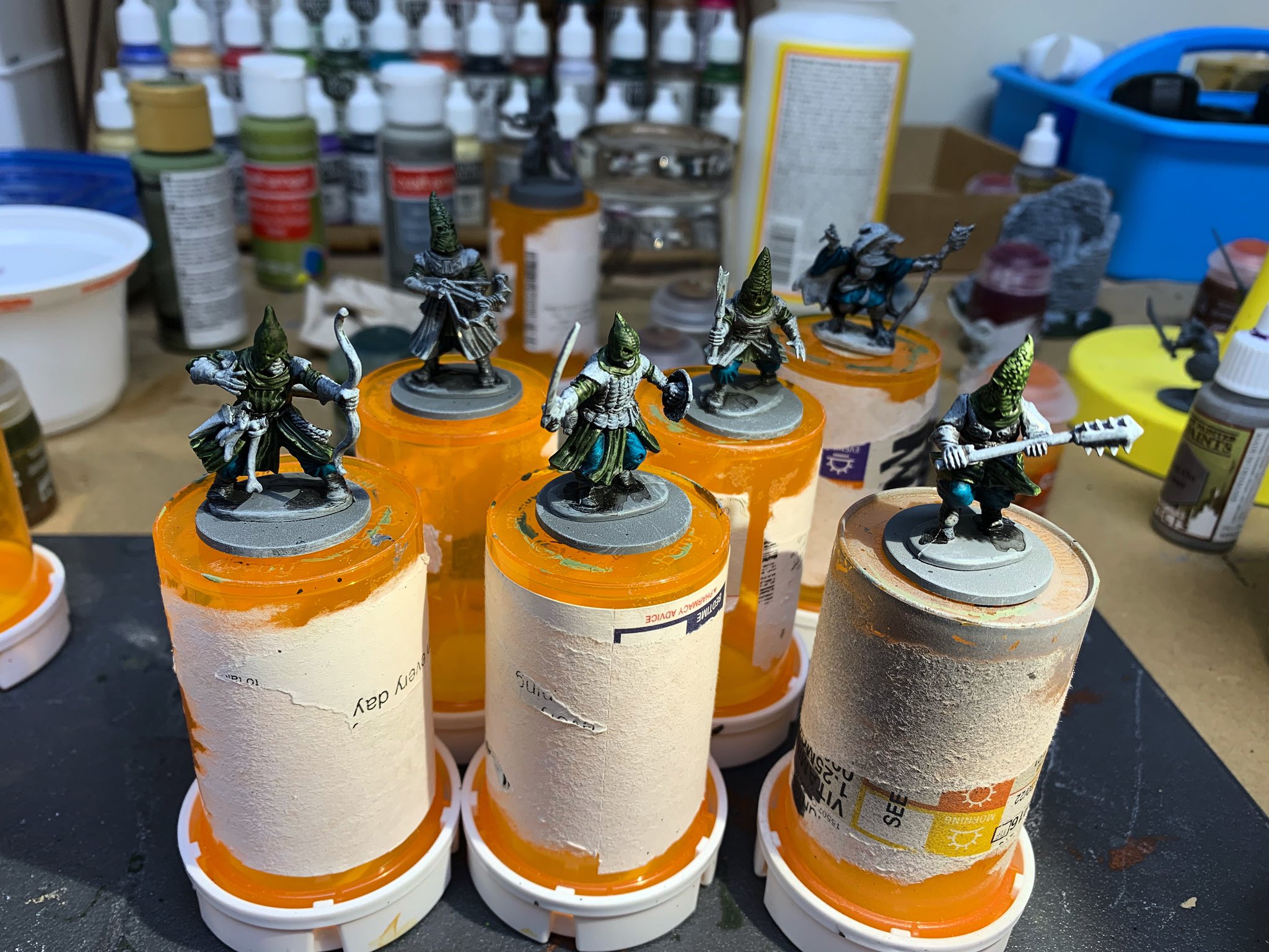
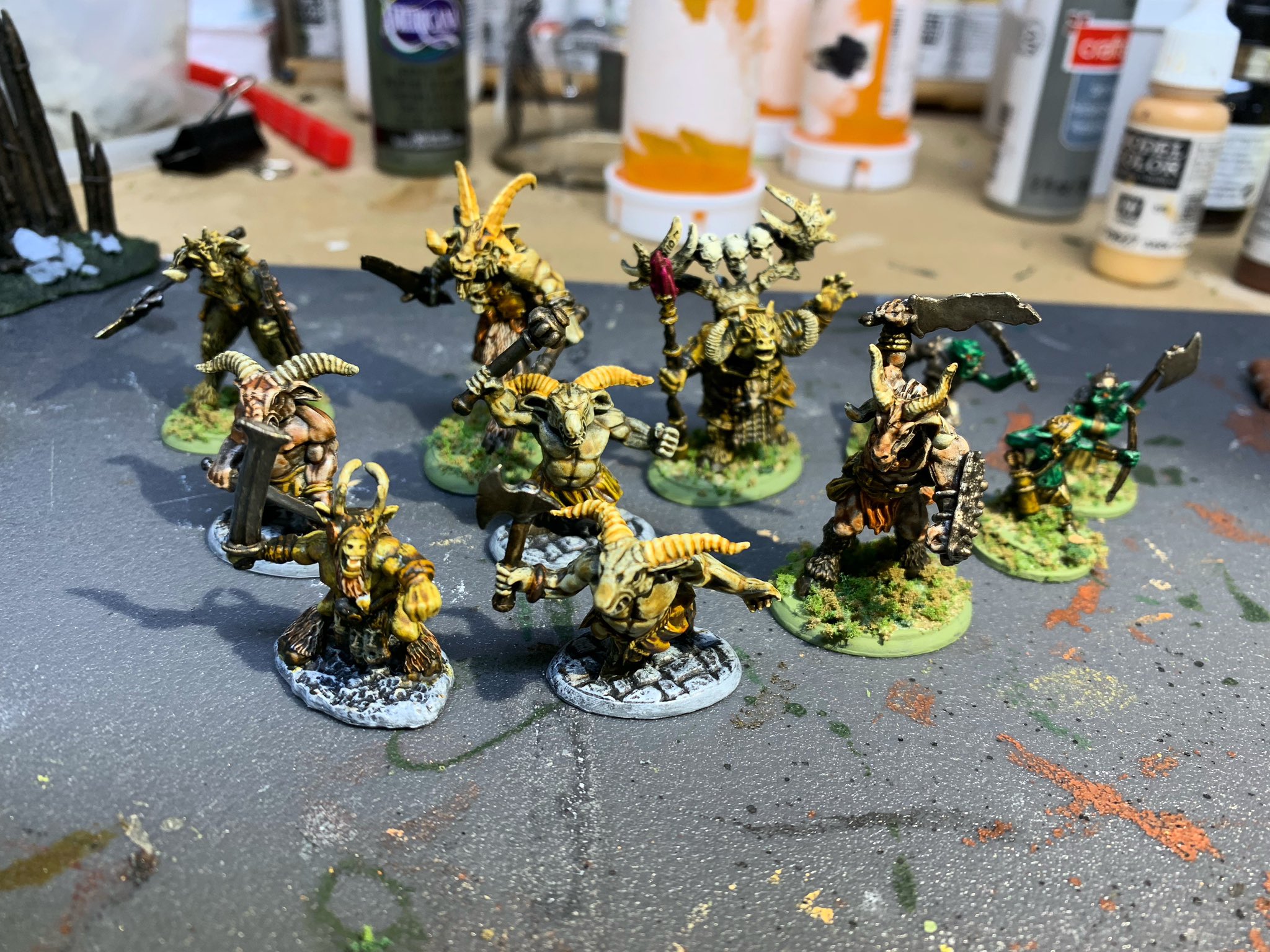
You can see with these cultists, the properties of the contrast paint easily give models with this undercoat method a great look. The nooks and crannies of the model get that deep tone of color, while raised sections with the white base coat have more depth over other areas on the mini. I could get a fair amount done with a single coat over different sections. And as the paints flow well and cover quickly, I could also get models painted up much faster than using conventional paints.

Hands down, using contrast paints will not give you the vibrancy and shadows that the Big Three offers. You cannot get the depth on a model that you normally would using blending. But if wanting to get a fair amount of minis painted to tabletop standard, contrast paints are an excellent choice. I had seriously thought of just giving a horde of my Zombicide minis a simple wash. Now I’m thinking that a quick coat of contrast paints instead would make them look fantastic. If looking for a means to get a fair number of models painted efficiently and still look pretty nice, contrast paints are worth looking into.